
Three Fold Hard Seltzer Dispense Font

Molson Coors made the jump into the hard seltzer world, debuting their brand Three Fold in 2021. The product’s name is based on the concept of “folding” the 3 main ingredients together to create a light and refreshing beverage. After a successful initial launch with their canned seltzer, they decided to pilot the product on draft, and came to Taphandles with nothing but their branding graphics and a dream; to become the first to market in UK draft seltzer.
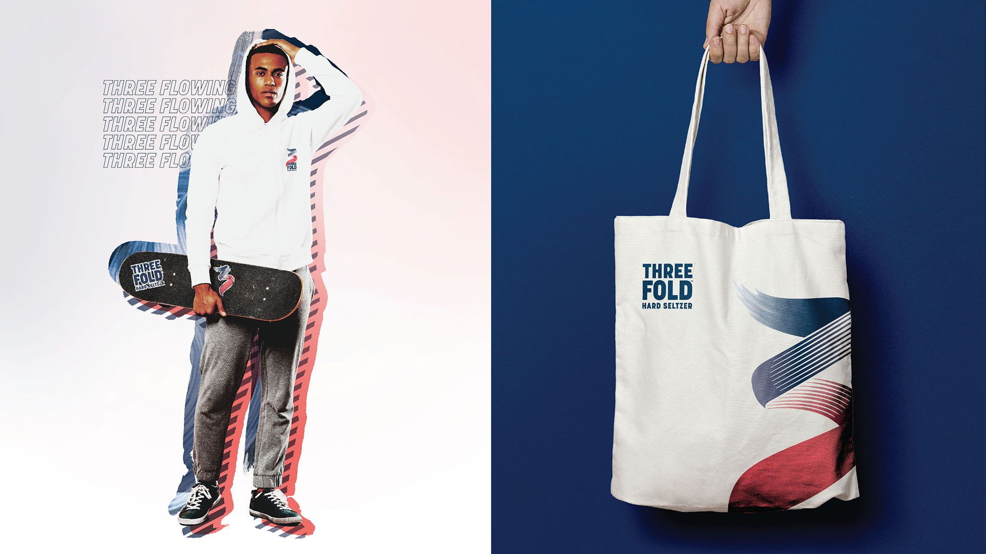
Print and Packaging Graphics
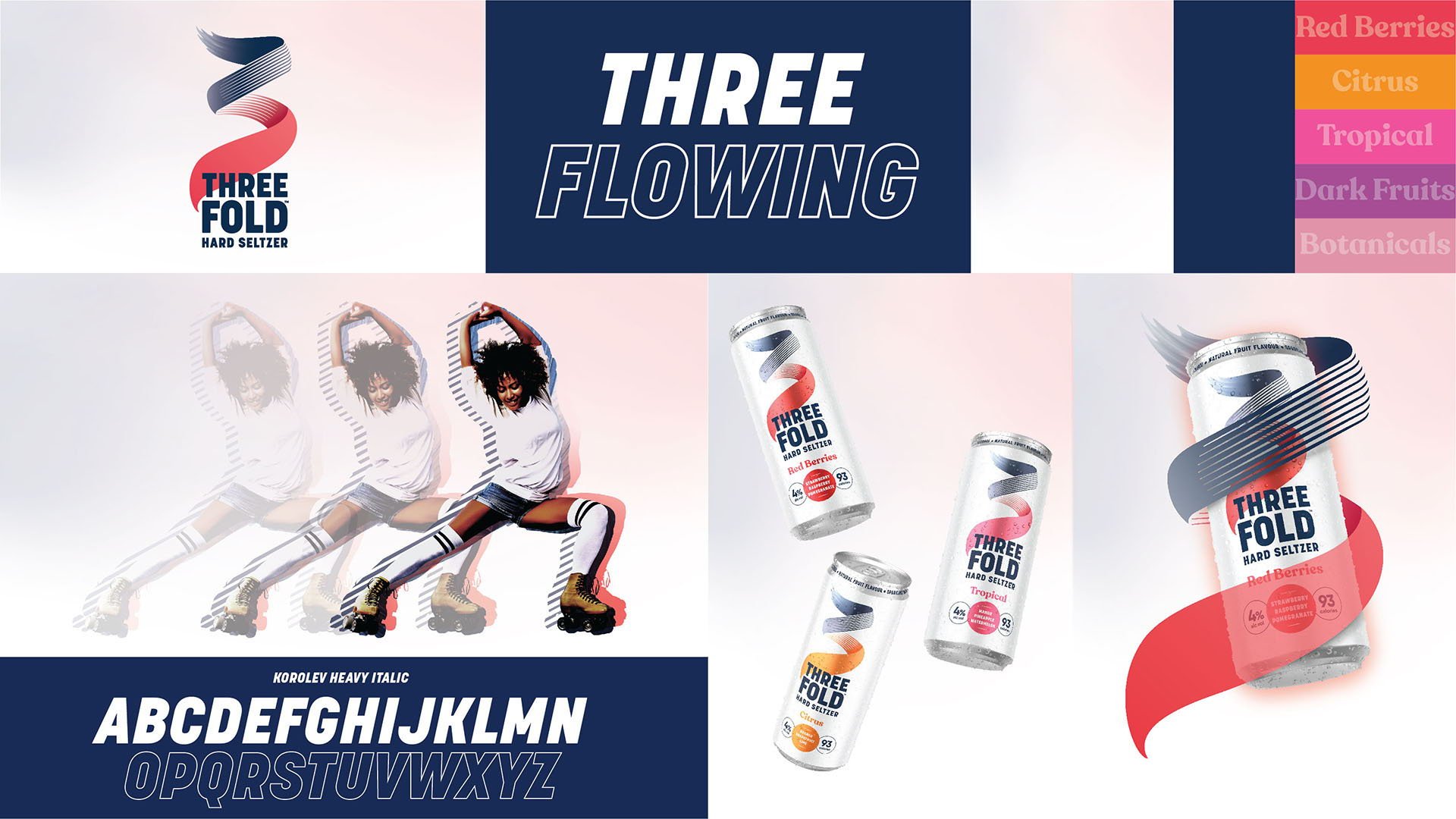


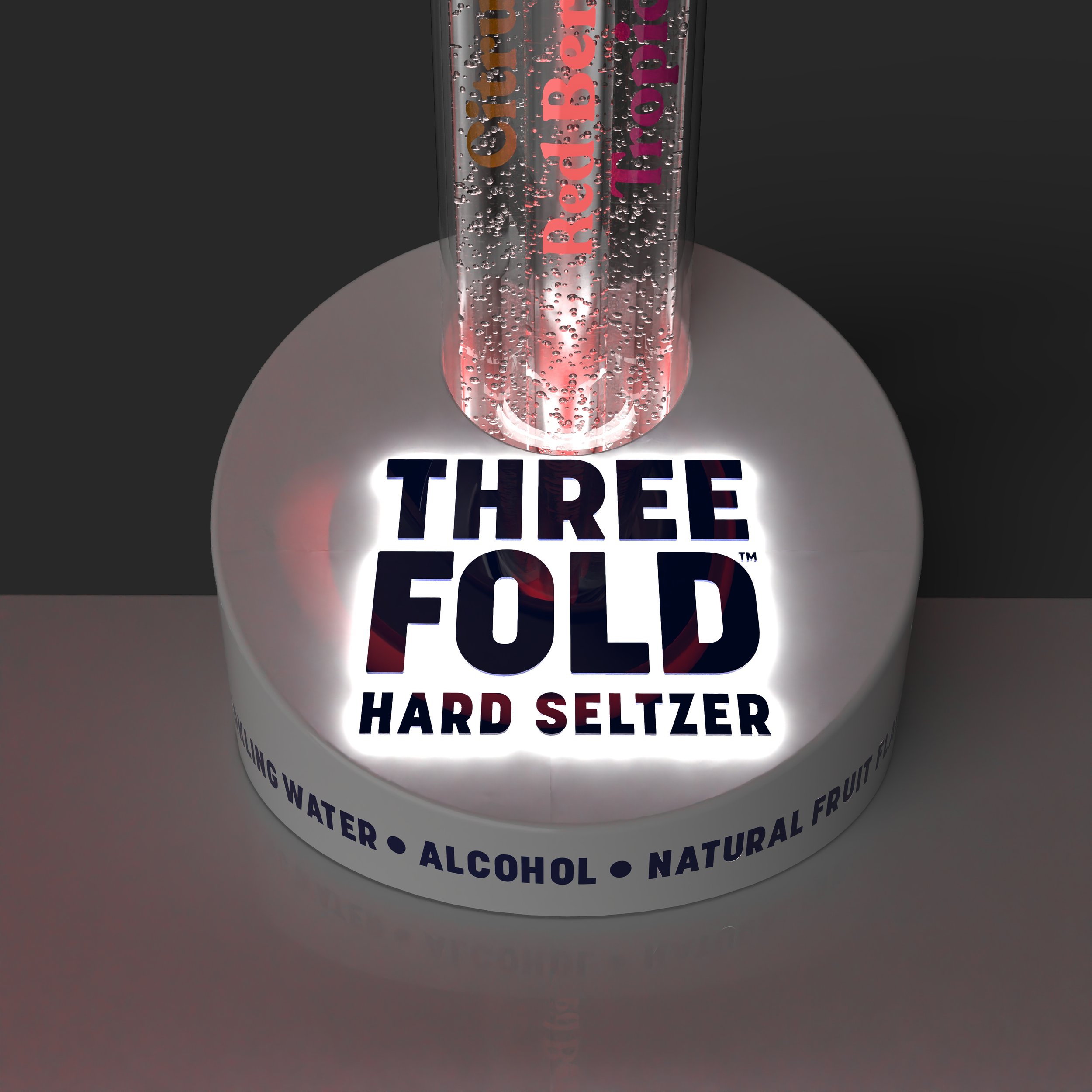
The “Three Flow” word mark is the crown jewel of the brand, encapsulating a light and flowing visual graphic that symbolizes the 3 primary ingredients: sparkling water, alcohol, and natural fruit flavor.
Initial Concept Sketches
Several different themes were explored in the first round of concepting. Themes included free-flowing organic forms bringing the “3 Flow” to life, helical tubes to represent mixing ingredients, and more traditional draft tower forms with a “twist”. (Pun fully intended!)


Early Concept Development
After a broad exploration of forms during the sketch phase, I created 4 CAD models of varying themes. These models were created to refine the concepts and experiment with various materials and lighting techniques. Below are renders and detail shots from this preliminary stage.
Theme 1


Theme 2


Theme 3


Theme 4


Theme Selection & Exploration
After the initial concept presentation, the general consensus was that there needed to be more emphasis on the “3 Flow” of the primary logo. This stemmed to a secondary sketch phase, where the feedback was incorporated into a new batch of concepts, and presented before further refinement would take place.


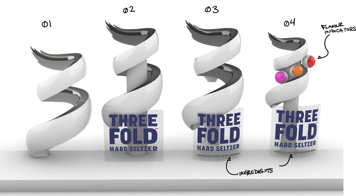
CAD mocks for quick iterations and graphic lockup variants.

Further Refinement
Live discussion with the customer led to gathering more feedback, and several new concept iterations were built to dial in the theme, proportions, and general layout. Molson Coors particularly enjoyed the use of transparent materials, and wanted further exploration to highlight the crisp, refreshing, carbonated nature of their new hard seltzer. Color and lighting also play key roles.
Refined Theme 1


Refined Theme 2


Refined Theme 3


Refined Theme 4


Final Design
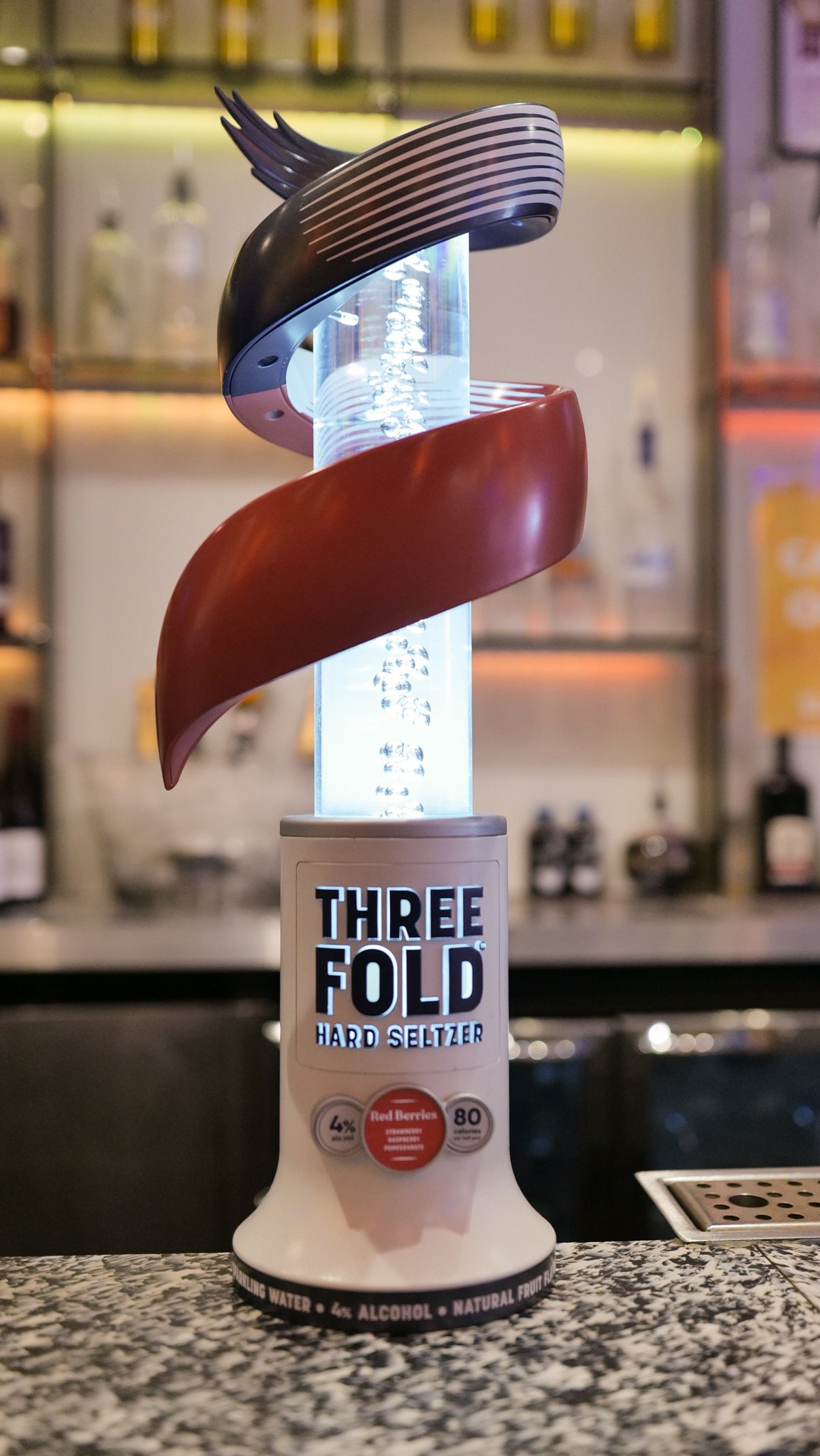
After thorough form exploration and refinement, frequent check-ins with Molson Coors and their brand team, and the mix/mash of several different themes, a final direction was chosen to move forward into prototyping and tooling. Renderings shown below are fully engineered and ready to dispense some ice cold, flavorful hard seltzer!


In-Market Production Sample


Early Production Packaging
Interact with me!
Pan, rotate and zoom to view the final product!